
The Evolution of MCU Telemetry: Beyond the Serial Monitor
Staring at a scrolling wall of text in the Arduino IDE Serial Monitor is a rite of passage for every maker. However, when debugging a PID temperature controller, analyzing motor encoder jitter, or tracking long-term environmental drift, raw text is practically useless. To extract actionable insights, you must visualize Arduino data in a structured, graphical format. In 2026, the ecosystem for microcontroller telemetry has matured significantly, offering solutions that range from zero-cost local plotting to enterprise-grade cloud dashboards.
This concept explainer breaks down the architecture of MCU data visualization, comparing local serial plotting against networked MQTT pipelines, and provides a technical framework for selecting the right telemetry stack based on your microcontroller's memory constraints and your project's latency requirements.
Core Concept: Data visualization in embedded systems is not just about drawing graphs; it is about managing the telemetry pipeline—the journey of a byte from an ADC (Analog-to-Digital Converter) register, through a transport protocol, into a time-series database, and finally onto a rendering engine.
The Telemetry Pipeline: From Sensor to Screen
Before choosing a visualization tool, you must understand the bottlenecks inherent in microcontroller data transport. The pipeline consists of four stages:
- Acquisition: Reading the sensor (e.g., polling an SHT31 via I2C at 400kHz).
- Serialization: Formatting the raw binary data into a transmittable string or binary payload (CSV, JSON, or Protocol Buffers).
- Transport: Moving the payload via UART, USB-CDC, Wi-Fi (MQTT/HTTP), or BLE.
- Ingestion & Rendering: Receiving the data on a host, storing it, and drawing the UI.
The weakest link in this chain dictates your maximum sampling rate. For instance, an ATmega328P (Arduino Uno) communicating over a standard 115200 baud UART connection can theoretically transmit about 11,520 bytes per second. If your serialized JSON payload is 40 bytes, your absolute maximum visualization update rate is roughly 288 Hz, assuming zero processing overhead. Pushing beyond this requires changing the transport layer or the serialization method.
Tier 1: Local Visualization via Arduino Serial Plotter
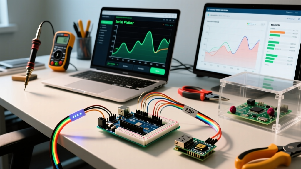
For rapid prototyping and local debugging, the built-in Arduino Serial Plotter remains the most accessible tool. It parses standard output streams and renders a rolling 500-point line graph.
Syntax and Implementation
The Serial Plotter relies on a strict, delimiter-based parsing logic. To plot multiple variables simultaneously, you must separate values with a comma and terminate the line with a carriage return.
Serial.print(temperature); Serial.print(","); Serial.println(humidity);
To add a legend, you can use the variable name followed by a colon in your print statements, a feature fully supported in the IDE V2 architecture:
Serial.print("Temp:"); Serial.print(temperature); Serial.print(", Hum:"); Serial.println(humidity);
Limitations and Edge Cases
- No Historical Storage: The plotter only holds the last 500 data points in volatile memory. If you need to analyze a thermal runaway event that occurred overnight, this tool will fail you.
- Baud Rate Mismatches: A common failure mode occurs when the host PC's USB-CDC driver cannot keep up with the MCU's burst transmissions, leading to dropped frames and jagged, inaccurate graphs. Always implement a
delay()or hardware timer interrupt to throttle the sampling rate to match the rendering engine's refresh rate (typically 30-60 FPS). - Floating-Point Overhead: On 8-bit AVRs, using
dtostrf()orSerial.print(float)consumes significant CPU cycles. For high-speed visualization, transmit raw 10-bit ADC integers (0-1023) and let the host PC handle the floating-point math.
Tier 2: Networked Visualization (MQTT + Time-Series Databases)
When your project moves from a workbench to a deployed IoT environment (e.g., a greenhouse climate monitor using an ESP32-S3), local USB plotting is no longer viable. The modern standard for remote MCU visualization relies on the MQTT publish/subscribe protocol feeding into a Time-Series Database (TSDB) like InfluxDB, rendered by Grafana.
The MQTT Pub/Sub Architecture
MQTT is lightweight and designed for high-latency, low-bandwidth networks. According to the OASIS MQTT v5.0 Standard, the protocol minimizes network overhead, making it ideal for battery-powered MCUs like the ESP32-C6. Instead of opening and closing HTTP connections, the MCU maintains a persistent TCP connection to a broker (like Mosquitto or HiveMQ), publishing payloads to specific topics like home/lab/sensor/temp.
The Visualization Stack: InfluxDB and Grafana
Relational databases (SQL) are notoriously poor at handling high-frequency sensor data. InfluxDB is optimized for time-stamped metrics. The typical 2026 home-lab stack involves running Docker containers on a Raspberry Pi 5 or a local NAS:
- Telegraf / Node-RED: Acts as the bridge, subscribing to the MQTT broker and writing the data into InfluxDB using the Line Protocol.
- InfluxDB: Stores the data with automatic retention policies (e.g., down-sampling 1-second data to 1-hour averages after 30 days to save storage).
- Grafana: Connects to the InfluxDB data source to build interactive, multi-panel dashboards accessible from any web browser.
Comparison Matrix: Choosing Your Visualization Tier
Selecting the right tool depends on your hardware budget, required retention, and latency tolerance. Below is a technical comparison of the most common architectures used to visualize Arduino data.
| Feature | Serial Plotter (Local) | Processing / Python (Local) | Node-RED (Edge) | Grafana + InfluxDB (Cloud/NAS) |
|---|---|---|---|---|
| Primary Transport | UART / USB-CDC | UART / USB-CDC | MQTT / HTTP | MQTT / Telegraf Agent |
| Max Sampling Rate | ~100 Hz (Visual limit) | ~1000 Hz (Buffer dependent) | ~50 Hz (Broker dependent) | ~100 Hz (Disk I/O dependent) |
| Data Retention | None (500 points) | Session-based (CSV export) | Days/Weeks (Local JSON) | Years (Down-sampled TSDB) |
| Hardware Cost | $0 (Built into IDE) | $0 (Open Source) | $0 (Requires Host PC/Pi) | $0 (Self-hosted) or SaaS fees |
| Best Use Case | PID tuning, quick debugging | Custom GUI, academic research | Home automation logic flows | Long-term environmental monitoring |
Deep Dive: Payload Optimization for 8-Bit vs. 32-Bit MCUs
A critical concept when designing a visualization pipeline is matching your payload format to your microcontroller's architecture. Sending human-readable JSON is convenient, but it can cripple resource-constrained boards.
The JSON Tax on ATmega328P
Consider a payload like {"temp":23.45,"hum":55.2}. This string requires 27 bytes of RAM just to hold the literal, plus the overhead of the ArduinoJson library to construct the object. On an Arduino Uno with only 2KB of SRAM, dynamic memory allocation for JSON serialization frequently leads to heap fragmentation and spontaneous reboots.
The Solution: Use CSV or binary structs for 8-bit boards. Send 2345,552 (multiplying floats by 100 to send as integers). The host PC (Node-RED or Python script) divides by 100 upon receipt. This reduces payload size to 9 bytes and eliminates floating-point string conversion on the MCU.
The ESP32-S3 Advantage
Conversely, if you are using a modern 32-bit board like the ESP32-S3 (typically priced around $8 to $12 in 2026) or the Arduino Uno R4 WiFi ($27.50), you have access to 512KB of SRAM and hardware-accelerated Wi-Fi. These boards can effortlessly serialize complex, nested JSON objects containing GPS coordinates, multi-axis IMU data, and battery telemetry without breaking a sweat. For these boards, JSON is the recommended standard because it allows the Grafana/InfluxDB ingestion engine to automatically map keys to database fields without rigid positional parsing.
Troubleshooting Common Visualization Failures
Even with a robust architecture, engineers frequently encounter specific failure modes when visualizing Arduino data. Here is how to diagnose them:
- Ghosting and Stale Data: If your graph shows a value dropping to zero intermittently, your MCU is likely resetting or missing a sensor read. Implement a heartbeat counter in your payload to verify continuous connection.
- Time-Series Drift: MCUs do not have accurate real-time clocks (RTCs) unless equipped with a dedicated DS3231 module. Never rely on the MCU's
millis()for absolute timestamps. Instead, have the ingestion server (like Telegraf) stamp the data with the precise NTP-synced server time upon arrival. - Ground Loop Noise in ADC Graphs: If your serial plotter shows a 50Hz/60Hz sine wave overlaying your DC sensor data, you are experiencing mains hum. This is a hardware issue, not a software one. Ensure your MCU and sensor share a common star-ground, and implement a software moving-average filter (e.g., averaging 20 samples) before transmitting the data.
Conclusion
Learning how to effectively visualize Arduino data bridges the gap between writing code that merely 'works' and engineering systems that are predictable, tunable, and reliable. For quick bench tests, master the syntax of the Serial Plotter. For deployed, long-term IoT telemetry, invest the time to build an MQTT-to-InfluxDB pipeline. By understanding the memory constraints of your MCU and the bandwidth limits of your transport layer, you can design a telemetry architecture that delivers clean, actionable data exactly when you need it.